

Mapping 10,000 Points of Hourly Power Use – Making $ense of Energy
In February, I asked my Electric Cooperative for help in understanding our solar panel output for 2024. They responded with 10,000 data hourly power consumption points over the 12 months of 2024 and the first two months of 2025.
As a renewable energy modeler, I was in renewable energy data heaven!
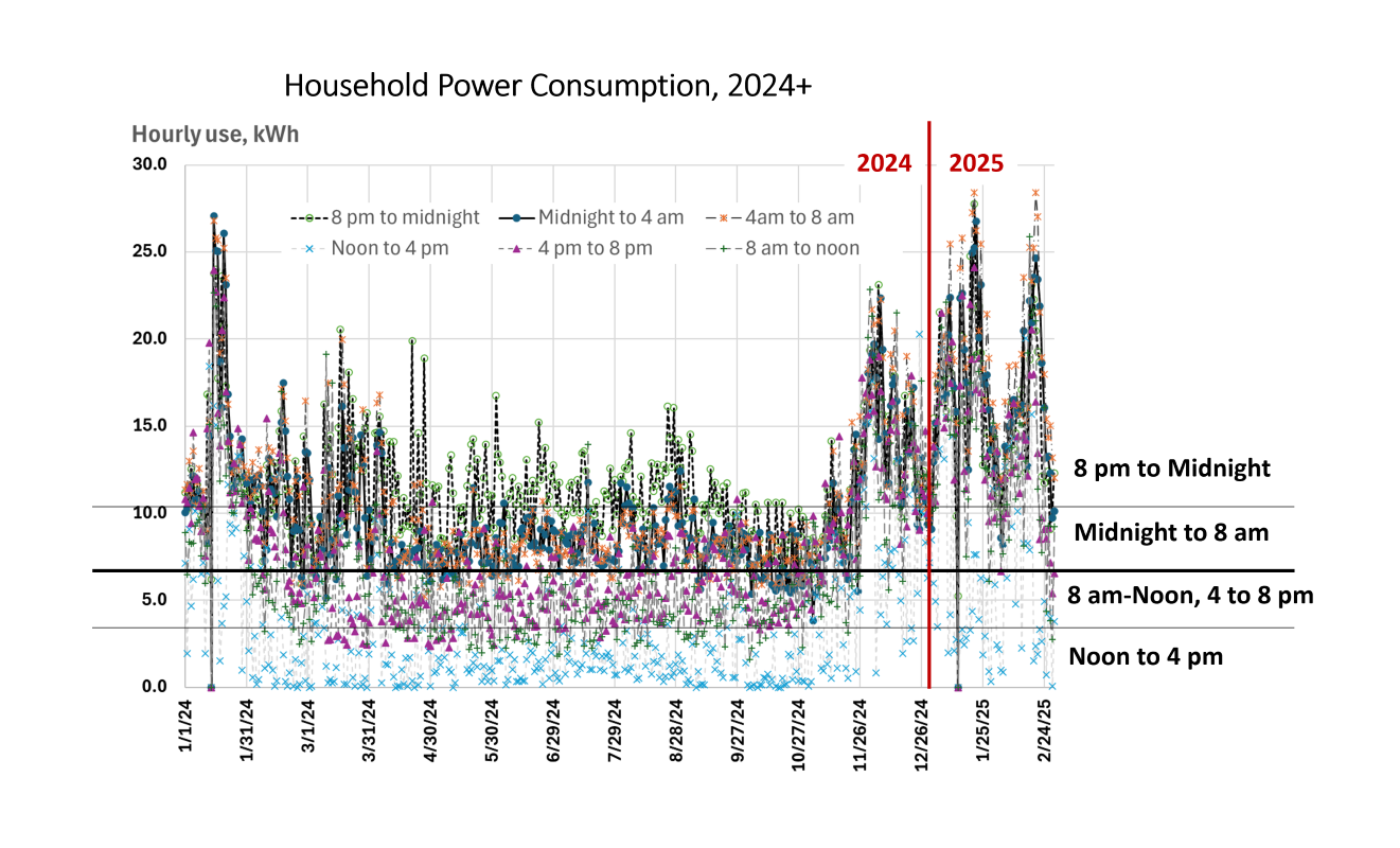
This chart is where I began. There are multiple stories in this dataset. The first transformation was aggregating 24 hours per day into 4-hour segments. These were my data-break choices:
- 8 p.m. to Midnight (4 hours), evening hours of power consumption after sunset.
- Midnight to 4 a.m. + 4 a.m. to 8 a.m. (8 hours), after waking hours until sunrise (sort of, the first hours of daylight do not produce much solar power, so it works).
- 8 a.m. to Noon + 4 p.m. to 8 p.m. (8 hours), Peak and Off-peak daylight hours with utility provided power plus solar panel offset power.
- Noon to 4 p.m. (4 hours), Peak solar power with supplemental utility provided power.
The first chart – not pictured here – included all 10,000 data points over the fourteen months, but it was intense, even for a trained data professional.
This dataset represents only power purchased from the electric cooperative utility. Solar panels offset power purchases, so the least amount of power was purchased when the sun was shining. The heavier black horizonal line across the chart represents an approximate break between daylight and nighttime power use. The highest use was in the evening when appliances were in use and no solar power was produced.
The utility provides monthly summaries of solar power purchased from our solar array. Monthly data does not fit automatically with hourly data. Our solar array provides power to our home first. Then the household purchases power from the utility. When we have surplus solar power, the utility purchases it at a reduced price. The household is motivated to supply all the power it can directly. It is a direct purchased power offset kilowatt (kW) for kW. It is nice that the utility purchases our surplus, but the reduced price isn’t a motivator for solar power sales.
The first two posts in this, Making $ense of Energy series focused on solar panel data. Our solar panel production is available in 5-minute increments, or 12 output points each hour. The solar data was downloadable in daily output files. Over the fourteen months, that was 420 daily files to download. Daily output files were loaded into monthly worksheets. Monthly worksheets provided annual summaries of 110,000 raw solar output data points.
The first impulse was to post about variation across months of solar data, or, Comparative Monthly Solar Output – Making $ense of Energy. As that story was being told, it was clear that it was important to tell the daily data before getting to the monthly aggregated average data story. Anatomy of a Residential Solar Collector Output – Making $ense of Energy, threw 30 days of hourly data into one story. It was kind of a mess. But the data chaos contained an important story: clouds block solar power frequently in downstate rural Illinois.
The fun revelation was that even with the array operating around 70 percent capacity for one fifth of a 24 hour day, the solar array was operating at or near design capacity.
This brings us to today’s data story. The data from the cooperative utility on power we purchased from them and solar power that we did not need that they purchased from us, is only part of the story. The solar panel data in prior posts provided total solar data output on the 5-minute data basis. The challenge is to build a model of total household energy use.
Once the total household energy consumption (use) is known, the most cost-effective path can be determined for expanding our power production options, as well as shifting our energy consumption options. That means modeling total household energy consumption during solar power producing times each day.
After multiple variations, we have had some success. As that story was being readied, it became clear that today’s seminal dataset would be a proper first step.
It is not easy being 1) a data modeler with a personal dataset that needs modeling, and 2) being friends or family of a data modeler with a personal data modeling project. The personal part, as opposed to professional project, removes all boundaries. There is no workday to provide data artistry work-life balance. And there are no confidentiality concerns to keep every social conversation to be about home solar data supply and demand. Everyone is ‘enjoying’ Mark Jenner’s data transformation enthusiasm.
The establishment of a home power consumption baseline sets the stage for exploration of other energy production technologies like small scale wind and hydro projects. Cost effectiveness is all about the margins. But the benefit of high-quality historical data upon which to build decision-making models cannot be understated. It is one thing to construct the entire model from hypothetical data. It is a much more robust adventure when there is reliable historical data available. More soon.
Comments
Mapping 10,000 Points of Hourly Power Use – Making $ense of Energy — No Comments
HTML tags allowed in your comment: <a href="" title=""> <abbr title=""> <acronym title=""> <b> <blockquote cite=""> <cite> <code> <del datetime=""> <em> <i> <q cite=""> <s> <strike> <strong>