

Selecting Meaningful Labels for 130,000 Data Points – What the Function
A year contains half a million minutes. The residential solar panel data arrived in five-minute increments, or about 20 percent of the annual minute universe. Adding in the utility generated data, the two data sources delivered about 130,000 data points.
Strictly high-level programmable statistical programs are very efficient for modeling established relationships. But when there is an element of relationship discovery, programmable spatial data systems like spreadsheets allow more organic trial-and-error relationship discovery.
A spreadsheet worksheet has two dimensions: rows and columns. Generally, the largest quantity works best in the rows and the lesser quantity works best on the columns. Sometimes the length of the label makes the rows more workable than long labels in a column heading.
Aggregation through additional worksheets and files adds a third dimension. In this project as data was aggregated from minutes to days, and days to years, new files were created. Multiple files allow data and project security. Data loss in a mistake or technology glitch does not lose everything.
In the solar data project, data was aggregated as follows.
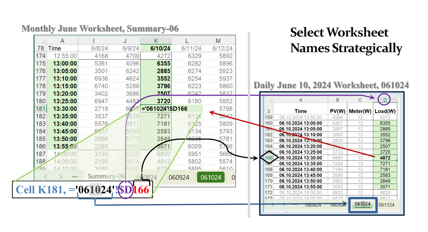
- The solar panels delivered daily data in five-minute intervals. One file, such as June 10, 2024, had a watt reading every five minutes. The right-hand image shows available watts in Column D. The time stamp in Column A provides the date + the time in five-minute intervals. In this case from 1 p.m. to 1:55 p.m.
- Each daily file was copied into a master file for June 2024 using the copy/move utility described in Sheets Happen, …But Not Automatically – What the Function. For June 2024, there were 30 worksheets, with one for each watt output in the original Column D in the daily file.
- The daily worksheets were labeled with a six-character date, mmddyy. Today’s example looks at June 10, 2024, or 061024.
- Once daily data was aggregated into a monthly summary, monthly summary sheets were copied into another file that aggregated 12 months into one year, 2024.
- At that point, 12 monthly worksheets, the utility-provided data was integrated.
- As illustrated in this example today, it worked best to put the days in columns and the hours (24 per day) in rows. This allowed separate datasets and transformations to be stacked by month, keeping the days in columns and simply adding another set of hourly rows.
- Once the monthly data was transformed into complete data tables without blanks, annual analyses could be conducted. This also allowed a simple filename change between analytical scenarios. Because the monthly data aggregation step reduced the daily data by 90 percent, the annual file was smaller than working with the entire dataset for each scenario.
The image on the left is a screen shot from the June 2024 aggregation sheet, Summary-06. The formula is from Cell K181 in that sheet. The ‘=’ tells Excel to bring the value located in source sheet, ‘061023’!. The exclamation mark immediately following is dedicated to identifying sheet names.
The rest of the formula is the cell address in the source worksheet. In this case, the cell is D166. Adding the ‘$’ anchor allows this formula to be copied across columns without changing the source column address. See Dr. Jenner is Absolutely Crazy about Dollar Signs – What the Function.
Since this transformation has both the source data and the target (or transformed) data in the same file, risks of complications are lower than sending cell formulas outside the open file, which is also possible. But over time the source data files may get separated from the active files.
This structure allows the first row in the summary sheet to be copied from June 1, across all columns to June 30. Then by changing the 2-character day value (’10’ of 061024) to the corresponding day value (01 for June 1, and 30 for June 30), all the daily sheet names get changed to the appropriate source sheet.
For the rows, there were no daylight hours before 5 a.m. and after 9 p.m. The first row began at 5 a.m. and the last row in Column A ended at 9 p.m. Once the 5 a.m. row had all the sheet names adjusted to the appropriate daily sheet name, simply copying that row to all the five-minute increments through 9 p.m. completed the summary table of days to the month.
The 12 values shaded green for June 10 between 1 p.m. and 1:55 p.m. show the watts produced at those times. The array has a 7600-watt capacity. On June 10, 2024, in the 1 p.m. hour the variability in output was high. The cell with the formula is at 1:30 p.m. with a power output of 4872 watts.
The first 24 active rows of each monthly sheet had a row for each hour of the day beginning at 1 a.m. The data was only collected beginning at 5 a.m. So solar production for the first 5 hours was zero. The data indicated at what hour solar power began being generated. In the case of the 1 p.m. hour on June 10, 2024, these 12 values were averaged and converted to watts (divided by 1,000 watts/kw). The resulting value became kilowatt-hours (kWh). This compact data table was copied without formulas to the annual summary file.
This worksheet labeling protocol had additional value reshaping data from a table of data by month or day, to a single time-series column nearly 9,000 rows long. But this data-reshaping transaction is best for another lesson.
Using representative worksheet labels with a 6-character date, mmddyy, facilitated very efficient direct references to daily source sheets and rapid expansion of the summary process. The term ‘naming’ was avoided, because Excel has very powerful range naming tools. The tradeoff between using functional labels vs. named ranges was even. The edge for functional labels won out, because the labels were transparent in function and identification.
Comments
Selecting Meaningful Labels for 130,000 Data Points – What the Function — No Comments
HTML tags allowed in your comment: <a href="" title=""> <abbr title=""> <acronym title=""> <b> <blockquote cite=""> <cite> <code> <del datetime=""> <em> <i> <q cite=""> <s> <strike> <strong>