

Lessons Learned from 18,000 Points of Light – Making $ense of Energy
The joy of finding a new dataset to explore enflamed my modeling focus more than was justified. IT WAS GREAT TO BE LOOKING FOR STORIES IN A BRAND NEW DATASET!
Challenge #1: Monthly data from the power utility was too course to make meaningful decisions about further expansion of the solar array. Hourly electric cooperative supplied data and hourly solar data was available everyday. The quest was to break each single, monthly data point into approximately 720 hourly data points.
- Local rural electric cooperative provided 14 months of hourly data use on power that was purchased from them. This is metered data is of power purchased from the coop.
- The coop utility also provided monthly data on power they purchased from us.
- The solar panels provided kilowatts generated in 5-minute increments (12 readings per hour) during the days when the sun was shining. This is gross solar production. The panels provided no kilowatt consumption data. The utility provided monthly power purchases, but no direct use.
- Solar power that was used directly by the residence has no meter. Since there was no solar power consumption included in the power that was provided by the utility, direct use needed to be estimated to get a measure of total power consumption.
Challenge #2: Two data sets (cooperative power use and solar power production) did not provide all the variables to solve for the missing variables easily. Proxies were used from the monthly and hourly data to fill in daily and hourly data gaps.
- Total consumption = Cooperative metered data + Direct use, unmetered data
- Direct use = Total hourly solar production – Coop metered monthly sales.
Filling in the gaps: As illustrated in the previous posts, solar production data is highly variable on any given day. The hourly data was robust on both 1) utility power consumption and 2) solar panel production. But these two data sets do not intersect. There were two significant types of information imbedded in the hourly data. Modeling tricks used to fill in missing data gaps with known available data included.
- Non-daylight power consumption. There were approximately 17 out of 24 hours each day (non-daylight) where utility power was consumed without solar power supplementation (daylight hours). Each day the non-daylight, power consumption was averaged. This captured the daily fluctuation of temperature for each day. This non-daylight power use average served as an assumed daylight power use benchmark.
- Direct solar use = Non-daylight power use ave. – Metered coop power use.
- Solar sales = Total solar production – Non-daylight power use average.
- Elimination of low sunlight days. No solar power sales occurred on cloudy days. Minimal solar production would be used directly and not sold to the utility. Low solar productivity days were removed from the sales and direct use calculations. Only the most productive days were used to model beneficial solar power.
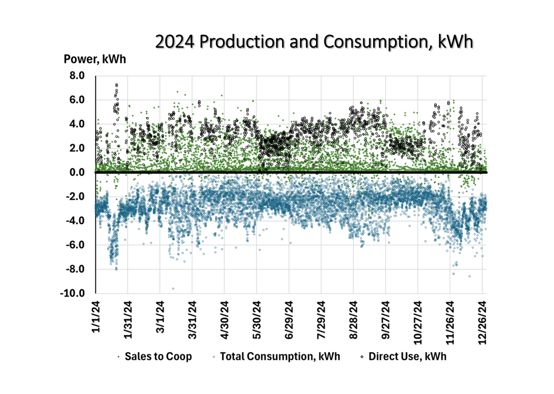
The chart contains 27,000 data points in three series. The negative data is total power consumption each hour. Recall our metered data only gave us power we purchased from the electric cooperative utility. But now we have filled in power consumption of both the cooperative and the direct use solar panels.
The positive data series with the lower value represents power sold to the cooperative (9,000 data points for each of the two series). This is kWh, not dollars. Our electric cooperative doesn’t pay as much for kWh sales as for direct use. Adding in the $/kWh sales become less impressive.
Our direct use power is not metered. The direct use data series is double counted in this chart but it serves my purposes. It filled out the cooperative supplied power + solar panel power used directly. But I wanted to model all three of these series.
- We did not have total consumption data, which was needed to understand how an expansion might help us. We have it now, on an hourly basis.
- We had solar sales to the cooperative, but only on a monthly basis. Now we have it on an hourly basis.
- We had direct use data. It was an offset at the monthly level based on our gross solar data production and the metered solar power sales (a subset of the gross production).
This adventure is pretty cool. I learned so much. The journey was more valuable than the model. But the model can grow from the foundation that has been established.
How did the model do? I give it a solid B grade. It performs above average. But there are some signs that there is work to be done.
We fractionated monthly data into hourly, daily data. There are two tell-tale rhythms that indicate there is some weakness in the assumptions used to fill in the unknow gaps.
First, there is a symmetry to the highs and lows that is a bit concerning. For 9 months, our home power consumption should be fairly stable. The mirrored highs and lows are less constant than one would expect in the area where we live. This leads to the second tell-tale sign.
Second, the variability is stable on a monthly basis. Each vertical grid line is 30 days apart. Within each month there is stability. Between the start and finish of each month there is a leap. This indicates that the model worked best within each segmented month at estimating the unknowns. However, the estimating power is constrained/segmented to each month.
For our purposes, this model is brilliant. There is certainly work to do. But it loses it’s fun when everything is easy. I am grateful for the knowledge and skills to go deep in available data to build helpful stories about our household operations for which important data is missing.
Comments
Lessons Learned from 18,000 Points of Light – Making $ense of Energy — No Comments
HTML tags allowed in your comment: <a href="" title=""> <abbr title=""> <acronym title=""> <b> <blockquote cite=""> <cite> <code> <del datetime=""> <em> <i> <q cite=""> <s> <strike> <strong>