Forecasting a Plague with Moving Averages
Moving averages are the most basic tool, taught in undergraduate courses as an introduction to forecasting. Prior to the pandemic, commodity futures charts were the go-to illustration of the benefits of moving averages for undergraduate students. Moving averages smooth out the highs and lows and they do provide a localized forecast that is better than extrapolation of a single record.
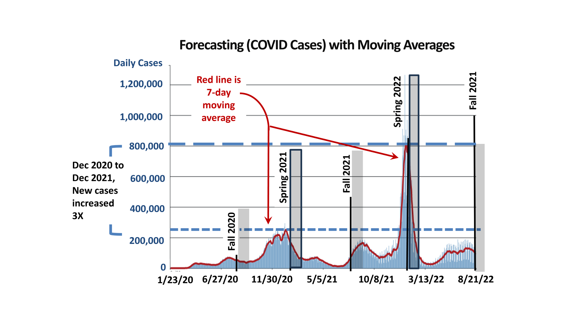
Then COVID-19 hit, and we (the world) did not know where to begin. The 7-day moving average became the ‘Little Engine that Could.’ And did!
There is no better time to learn economics than when the economy is on fire. And when the pandemic hit, regardless of any political position, the economy was on fire.
New cases reported daily became a measure of COVID intensity. But what is a ‘new case?’ It took most of a year to get some consistency in what was reported as a new case. In the economic chaos, reliability of the new case data could not be established. Because it was the best data available it became the baseline.
First in each nation, and then among U.S. states, each government established its own data protocols. Initially, they were often not the same protocols.
- When did a case that had a positive test get reported?
- False-positive and false-negative tests (statistical lingo) became coffee break conversations.
- What is an authentic daily case of COVID?
A plague had arrived and the speed of urgency defined data resources as limited for quantifying the emerging threat to humanity.
Always on the hunt for real data for students to develop a simple linear regression, this daily new case data was a fascination. In 2020, no one really knew what was being tabulated. Mondays always had a bump, because there were gaps on Sundays. Day to day, the data was highly variable. A 7-day moving average was the most sophisticated the quality of the data would permit. It was difficult to believe that a moving average was the best we could do. Then the Center for Disease Control (CDC) began presenting their charts in the same manner. Validation. At least another institution had come to a similar conclusion.
The dataset itself was intriguing. Before the Fall 2020 semester began, the new case peak had occurred in July. Some hoped by August that this was the end of the feared pandemic. This is the data students viewed at the start of the fall semester in 2020. Spring semester 2020 never returned after Spring Break, so it was a relevant topic of discussion. By January 2021, the start of the Spring 2021 semester, for nearly a month the CDC reported daily new cases of COVID-19 of over 200,000 per day.
By Summer 2021, new cases had dropped to very low levels. Again, there was hope that this difficult period was behind us. By August and the start of the Fall 2021 semester, new cases had again begun to climb and would continue to climb until the end of the year. This trend finally peaked in January 2022 where new cases would reach 800,000 new cases per day. In one-year, new cases per day had increased threefold. This was 22 months into the adventure.
Fortunately, new cases finally began to decline in 2022. Throughout the three year period, new case data improved, but always had an element of uncertainty imbedded in the data. Different COVID tests worked better than others. It was clear some got COVID and didn’t test positive, while others never went to a doctor, but were sick. As restrictions were lifted, fewer people got tested. Then the data collected was more certain, but whether it reliably showed the activity of the pathogen was less certain.
Through it all, the most reliable forecasting tool was the 7-day moving average. The new case data of the current day, and the preceding 6 days, were averaged for a data point. Then the next day, the same procedure was used with current new cases, plus preceding 6 days prior, averaged together. The 7 days of cases were averaged, and the averaging window moved forward, and became a moving average.
This basic moving average technique became the foundation of public health and policy decisions over the course of three years. The tools that are available today are very impressive. This presentation is not a criticism of the pandemic policies. It is more about the robustness of even the basic applied forecasting tools. No one wanted poor quality data. But in the absence of better-quality data, the simple moving average technique carried the day.


Comments
Forecasting a Plague with Moving Averages — No Comments
HTML tags allowed in your comment: <a href="" title=""> <abbr title=""> <acronym title=""> <b> <blockquote cite=""> <cite> <code> <del datetime=""> <em> <i> <q cite=""> <s> <strike> <strong>